Baltimore Snap is an easy-to-navigate website containing fun pics of the wide range of social and networking events around Baltimore. Snap shows how Baltimoreans get together to mix and mingle, have fun, maybe do a little business, and support a good cause – sometimes all at the same time.
The catalyst behind Snap is Baltimore’s longtime social and style guru, Sloane Brown. Since September 2018 my role has been in support via marketing and promotional collateral, photography contributions and website template maintenance and content management.
The Snap Girl was inspired by a 1940s flyer. She was created before my tenure and, in my opinion, underused. I added a simple circle to give her weight and a more applicable shape. I love the diagonal line trough the circle she makes.
Though a typographical logo already existed, some tweaking was needed for readability. In the previous version, the “n” in “snap” looked a bit like a “w”. This could have led to a misinterpretation of the company name and what was being offered, so the “n” was clarified.

Cocktails & Conversation
Cocktails & Conversation is a new and exciting endeavor for Baltimore Snap. Sloane Brown uses her skills as a on-air personality and journalist to introduce us to Baltimore’s movers and shakers in a relaxed environment. This video series is published weekly through the Baltimore Snap website.
In keeping with the idea of a logo reflecting the content of the series and the series host, a “talk show” look seemed to stand out as the most effective solution. This is actually animated in the opening of the video series.

MEDIA KIT
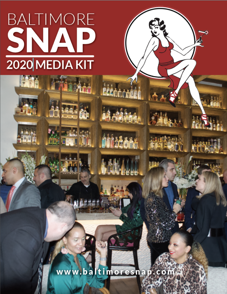
TheMedia Kit was created for marketing purposes. This is another document that is continuously evolving. Much of the information (particularly statistical) changes periodically and must be updated. You could say it is in a permanent state of work in progress.
BALTIMORE SNAP WEBSITE
Baltimore Snap’s website is an image heavy WordPress site that I maintain with content I manage. When I first joined Baltimore Snap, the pages had very inconsistent layouts and was a little redundant. This was resolved and now the site has a good flow. There is a tone of content, so as with most visual sites, it is in a constant state of evolution.


